 I also used tracking shots to give the impression that the characters were being followed by the killer at all times. I also used close female friendships as the focal point of the film and trailer. By using this, it allowed us to incorporate the stereotypical stock characters that are included in films set in high school, such as the “popular rich female characters.” I also incorporated the convention of building tension towards the finale of the trailer by including quick cuts and including lots of screaming by the characters. All these conventions are used in other high school horror trailers such as: Scream (1996), I Know What You Did Last Summer (1997),
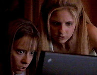 Prom Night (2008)
  and Jennifer’s Body (2009),
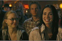 which all appeal to our key demographic. Moreover, I developed the technique used in the Jennifer’s Body and Prom Night trailers, using a red screen to symbolise blood or danger. For my trailer, I mixed this technique with the white flash (mini-polarisation) of an inverted image of the main character's face; this can be seen in the trailer for the 2005 film The Exorcism of Emily Rose (2005).
 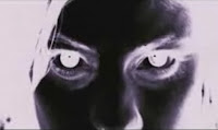 In their trailer, it was used to shock the audience as it suddenly appears at the end of the trailer.
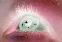 For my media text, I developed this by using a still of an inverted eye and changed the colour of it from red to black as the trailer progressed. This was to create an effect that had connotations of blood but also made the audience feel uneasy and tense. I challenged the use of including various locations throughout the trailer instead I decided to shoot the entire film a school. This was used to increase the amount of claustrophobia that the characters and the audience fell whilst watching the trailer. This was achieved by using corridors that were long, dark and empty. Furthermore, I do not allow the audience to see anybody’s face that is not a student at that school. Usually, in horror trailers we see all the major characters that will be vital to the plot of the film; however in my trailer I did not use this on some of the key characters.
  By not seeing their faces it makes the audience unsure whether or not they can trust this person or if they will end up becoming the killer. In addition, by keeping this level of anonymity it causes tension within the audience’s sub-consciousness as their minds immediately take this image to be frightening and creating a sense of danger within them. Another convention that we developed was the use of text on the screen, which is used to inform and guide the audience as to what is happening. In the Scream trailer they use this convention by having the text appear on screen written in white and expand and turn to blood red.
  In my media text, as the trailer progresses the colour of the text changes from white to red. This was used to show how at the start of the trailer everything is calm and normal but by the time the text is written in red everything is not fine and we are heading towards chaos. Moreover, the red also is used as a foreboding technique because as the text cuts away, the first victim is killed.
kk..............................................
As part of the marketing campaign, we had to include a movie poster and Empire magazine cover. These two ancillary texts were very effective in reflecting the chosen genre of my media text and also able to gain a sense of the eeriness of the entire media text I had created. 
n the movie poster covered by the darkness of his hooded jacket. This was used not only to create the enigma of who is this character but also it’s the same technique I employed for the trailer, as we never fully see the killer’s face nor do we ever see anybody’s face who has authority. Furthermore, this is an indexical reference to the fear that a youth wearing a hooded top creates within our society. Moreover, to create the theme of my chosen genre, I also included the faces of the main characters to be the subordinate image both in ghostly whitey blue effect on the movie poster.
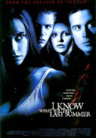 This technique was incorporated because it is very commonly used on posters of this genre it is used on posters like I Know What You Did Last Summer, and Sorority Row (2009).
 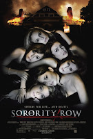 It will also easily help our audience identify which genre my media text is associated with.
jjj.........
 During our media trailer, we represent the typical high school stereotypes and clichés. At the start of the trailer we introduce the audience to “popular” female group of students: Mary-Alice, Robin and Cory, they would be at the top of the high school hierarchy within their peer group. Although we do not see the faces of the characters until they are sitting in their English classroom, we used the dress codes of the characters to allow the audience to make this decision.
  This was achieves by the main character Mary-Alice wearing a branded purple jacket, by using the colour code of purple it represents royalty and mystery, again reinforcing these characters importance in the school hierarchy. In addition, the other characters were wearing clothes set around the light colour codes which in Hollywood are used to suggest that these characters are good and pure. Also the fact that the characters get out of a car, again highlights their status within the school. After that we are then introduced to “loser” of the school: “Kevin.” We are able to deduce this from his dress code; he is wearing a basic t-shirt and jeans along with glasses.
  The first shot we see Kevin in is a wide angle shot which we see him sitting alone whilst the other “popular” characters sit on the other side of the classroom. Also we gain this opinion because he is sitting at the front of the class writing whilst the others are just starring at their work, they are also sitting at the back of the class, again showing Kevin’s “nerdiness” and the other characters “coolness”. This shot shows the split between the stereotypes and how unfriendly students can be towards characters that do not fit with what they think is acceptable. Kevin’s physical separation in this scene connotes alienation. And it is this theme that causes the audience to believe that because he is sat alone Kevin will be the first victim. The character Kevin also falls under the role of the Snert according to Bishop’s 2008 character theory. His theory states that in an online community you will find eleven typical character types, one of them being The Snert. A Snert, is a character driven by anti-social behaviour and will seek to offend their target because of something they said.
 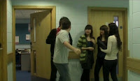 This is can be seen in the next scene where we see him being rejected by Mary-Alice and thrown to the floor by Ben (Jack Naylor). In addition to Bishop’s Theory, our characters also follow Propp’s 1969 character roles. The use of Propp’s theory and also the typical stereotypes are traditionally used within films of the high school horror genre. Propp’s theory states that there are seven broad characters that can be found in many media products, an example is the villain who struggles against the hero. For our trailer, we use Propp’s theory to a degree. Some of the characters that fall into Propp’s theory actually fall into a mixture of Propp’s character roles. For example, the character of Jean Taylor (the teacher) is the dispatcher and also the hero of the film. This was done because we wanted to keep aspects of the horror genre that will allow the audience to understand these characters simply. But we also wanted to decrease the number of characters there were included in the final product, this was to re-enforce the isolation of the characters and show their vulnerability.
  Warner Brothers produces mainly thriller, action and horror films.
 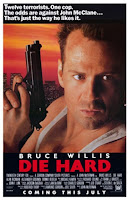 20th Century Fox produces mainly action, Sci-fi, comedy and also horror films and Paramount Pictures produce mainly action/adventure films along with many family films as they own the children’s television network Nickelodeon.
  To gain a greater judgement I looked at the production companies form movies of the same genre, Jennifer’s Body was distributed by 20th Century Fox, I Know What You Did Last Summer: Columbia Pictures, Carrie (1976): Redbank Films, Scream and The Faculty (1998): Dimension Films and Prom Night: Alliance Films.
  From this research, I have come to the conclusion that Dimension Films would be the best institution to distribute my media text. This was due to the fact that they made the box-office hit Scream (trilogy), and other high grossing box office horrors such as Halloween H2O (1998) box-office domestic gross: $55,041,738 and The Amityville Horror (2005) box-office worldwide gross: $ $108,047,131.
 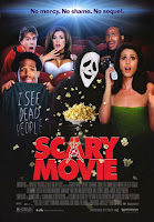 As well as that they have produced the 2000 high school horror spoof Scary Movie, showing that they understand the typical conventions of the horror genre and are able to attract a wide audience and produce a film that is a minor parts scary (box-office worldwide gross of Scary Movie: $278,019,771).
  Although, it was hard to chose between Dimension and Warner Brothers, even though they have not made a high school horror film they do have a good reputation of making classic and iconic horror movies that stand the test of time, including:
  The Exorcist (1973) and
  The Shining (1980).
 .......
To secure the right target audience for the our media text, I did some research to see what the typical
 audience demographic was for films of the same genre. For this I looked at the films: Scream, I Know What You Did Last Summer, Carrie and Jennifer’s Body. I then searched these films on the website: The Internet Movie Database (www.imdb.com) and looked at the user rating system to see what age groups were preferring these high school horror films. (Here is an example of how the film Scream was rated:
 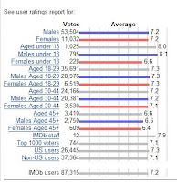 ). The highest scoring groups for all these films were the viewers under 18 years old. From this research, I decided to aim our product at the older teenage/ young adult demographic, ranging from 15-21 years old.
  Furthermore, I expect the film to gain the classification of a 15, meaning that we will be able to attract this audience effectively. It also allows us to include more realistic responses to attacks and more adult storylines for the characters on screen. Moreover, I plan to advertise the product in the traditional form, of TV adverts, movie posters and actor interviews. Along with this I also plan to incorporate some elements of the viral campaign, I will have a film website, along with Twitter/ Facebook pages of the character in the film.
  The viral campaign was previously used for the advertising campaign for the film Cloverfield (2008) (for an example: http://www.myspace.com/hudsonplatt this is the myspace page for the character Hudd, on here you can view other character's pages from the film,) and also for the teenage television drama Skins (2007) (for an example: http://www.myspace.com/skinssid this is the myspace page for the character of Sid and like the Cloverfield site you can access the pages of other characters from here.) Even though there has not been a high school horror film that used this as part of their advertising campaign yet, the success of these two media products has made mixing these two marketing campaigns key in gaining as much attention and success for new movies as well as for my trailer.
 In order to know if we had successfully appealed to our target audience, we asked a group of experienced media practitioners around the ages of 16-18 to view our trailer. They all correctly guessed that the trailers genre was horror, claiming that conventions such as: characters screaming, “shaky camera scenes,” and the use of a red screen to symbolise blood made them assume this. They also said that the flashing inverted images came across as scary. Moreover, the audience also correctly guess that the main premise of our trailer to be about a killer, who was following the plot of book and murdering students at a school. They were also able to establish that the main characters were Mary-Alice and Robin, although they did not know their names. They also said that Kevin looked like he would be the killer. Although, by the end of the trailer they did claim to be surprised when they heard the female voice over say “I wrote the book, I choose the endings,” leading them to question who they thought the killer was; this is what we were aiming to achieve. When asked if they would see the film upon its release, the whole audience agreed, they felt that our trailer left them with a lot of questions that they want to find an answer to. Such as: “who’s Kevin?” “What was the book really about?” “What did the head teacher have to say?” (Although this audience member then immediately said “that maybe this meant the head teacher was in on the murders?”- this was very interesting, as it was not something that I had interpreted before, it’s a very clever twist which if we had thought about earlier, could have added to the mystery of our feature film.) Some of the audience who were not fans of the horror genre said they would still see the film upon its release because of the underlying “funny” element. This was the scene where Kevin was laid on the floor and said “my name’s not Kevin.” Based on this feedback, it shows that we were successful in creating a trailer of the horror. Although as some of the audience members found some elements of the trailer amusing I believe that if we had the chance to re-edit our trailer, I would consider either re-shooting this scene to make it more dramatic and avoid some classing the trailer to be within the spoof genre. I would also re-shoot the radio scene, to make it more obliviously that it was a radio report that the audience were listening to and not a narration. Overall, the main reason that our target audience would see our feature film was that they were intrigued and wanted to find out who the real killer was.
After the production process of our trailer we moved into the post-production section. In Hollywood most films companies use the software: Apple: Final Cut Pro; to edit my media product I used the editing software: Adobe Premiere Elements. Although it includes very basic editing software, it actually helped me quite a bit in achieving a smooth flowing trailer that looked professional and included all the typical editing conventions other horror trailers use. With the layout being easy to understand, I was able to change the pitch and bass on the heartbeat and boom sound effects, creating a more dramatic and frightening sound.
 Moreover, it was easy to invert sections of film that helped me to incorporate the convention of quick invert image flash; it also made some continuous shots that I changed to invert shots in order to make them appear more ghostly and unnatural. As I became attuned to how the software works, I was able to overlay scenes which gave the app
......
 Over the process of moving from our AS media text to A2 media text, I believe that I have gained a lot of experience and information about how much time and effort it takes to produce and develop a movie. It has made me more aware of how important the pre-production element of the task is if something does not work in this stage it is highly likely that this problem will still not work when you come to shooting the film. Overall, the progression from AS to A2 has made me realise how important it is to have a co-operative group of people who are willing to work collaboratively to help you create the finished product that is at a professional standard.


